
Provel Travel App

Makes your travel experience smoother

Timeline
5 weeks
Role
UI Design, UX Design, UX Research
Project Type
Personal project
Platform
Mobile
Overview of Provel
Provel is a user-friendly travel experience app that consists of various categories such as Food, Hotels, Flights, Transport, Attractions, and Events. The user will be able to view any travel package and will be able to view the details of the travel package. There are local and international packages available for the users.
My Responsibilities
-
Conducting user interviews with the users
-
Creating personas, user journey maps
-
Competitive analysis
-
Providing digital low-fidelity wireframes
-
Provide high-fidelity prototypes
-
Conducting usability testing on the Provel travel app
Problem statement
Some apps do not provide a proper onboarding experience for the users, hence leaving the users confused. The other issue is that many travel apps do not have an easy payment experience where they have to manually write all the payment details to make payment for the travel packages.
Research - Understanding the user
User Research
I conducted interviews with the users to understand their requirements for the travel app. This is to ensure that they get a positive experience while using the Provel travel app.
Qualitative interviews
Here are some user interviews with the users related to an existing app like Expedia

"An onboarding experience would be much appreciated because I can know what the app can provide! Payment would also be a great option!"

"Features of the app need to be mentioned so that we do not feel like after we have signed up, we know nothing about what kind of features the app provides, yes an onboarding experience is good, I also want the payment access to be faster too!"

"It would be better if an onboarding experience is there so that we know the app features and I really want the payment method to be made in a faster manner too!"
Quantitative interviews
5
users had taken part
100%
want onboarding
100%
want payment faster
There were 5 users who had taken part in the interview related to an existing app like Expedia. This is to understand what they really want to see from the app. All 5 users suggested that they wanted to see an onboarding experience from the travel app. They wanted to see an onboarding experience as the travel app will be able to inform what all features it has from the travel app. The travel app would be great if the payment is made faster. All 5 users (100%) wanted to ensure that there is an onboarding experience and the payment method should be made in a faster way.
Personas
This is one of the personas of one of the users from the user interviews relating to an existing app like Expedia:
Penny Brown wants to ensure that the Provel Travel App has a good interface, the payment method is faster and secure and onboarding process is made available

User Journey Map
This is one of the user journey maps for one of the users from the user interviews and this is applicable for an existing travel app like Expedia travel app:

Competitive Analysis
Here a competitive analysis had been done to ensure what the current travel apps are giving to the users. Several of the features have been listed.

The key concept here is that these apps need to provide a proper onboarding experience and easier payment experience.
Ideation Process
Here is an ideation process on what the Provel travel app would look like. It will help to generate ideas. All the ideas have been taken into consideration.

Design Process
Information Architecture
A user flow provides a user directory map on how the users will be able to navigate the Provel travel app.
Design decision: The information architecture was necessary because it gave a clear picture of what the navigation would be like. The navigation would be easier to access and understand how users will be able to access the Provel Travel App.

Digital Wireframes
Wireframes will indicate what all features will be included in the Provel application. This is very necessary whenever creating an application. The travel packages of Provel have various categories ranging from hotels to events.
Design decision: These are skeletal designs of how the Provel travel app would look to ensure that users can understand what the design flow would be like. Users will be able to book anything ranging from hotels, events, and flights. These skeletal designs provide how users can search and book from the app.


Provel Style Guide
The Provel Style guide is a rulebook that defines what components are being used in the Provel Travel app. This has been very useful for maintaining consistency throughout the application.
Design decision: The colors chosen wanted to indicate that travel is related to nature where people will explore other places to rejuvenate themselves. The typography part would make sure that the text is readable and consistent. The icons would provide more illustration and fun to how users can perceive it. The logo represents the brand of how nature would look like.


Design System Components
Design decision: These are various components that have been used in the Provel travel app conferencing that makes the usage from the basic components. These components are used to ensure that the app maintains consistency.


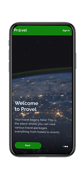
High Fidelity Prototypes
High Fidelity designs provide consistency based on the style guide and the design system. The content is based on the wireframes
Design decision: This platform is to give users a place to navigate through the hotels, events, and flights. This app provides a boost to the energy that rejuvenates users to use and recommend this app to others. This app provides an onboarding experience to ensure what features it can provide and an easier payment user experience like a scan card option.


Video on the user flow of Provel Travel App
Interactive Prototypes
Usability testing
-
Usability testing of the revamped student portal was conducted with 5 users
-
The users are able to know what kind of features are being provided by the travel app. An onboarding experience has helped them
-
It provides a faster payment method where the user can scan their card to pay the booking
Result metrics from the usability testing
5
users had taken part
1 min
to complete the task
98%
task success rate
2%
error rate
These were some of the success metrics gathered from the usability testing for the Provel Travel App
Quotes from users on the Provel Travel App
"I like the onboarding experience, it tells me what all things the app provides and the scan card option of payment is really good! I do not have to enter details manually which is good!"
"Cool features! It is good that the payment experience has become much smoother!"
"I like how this app has provided so many varieties, promotions! People will definitely use this!"
Learning Outcomes
-
I learned the importance of why conducting usability testing was important
-
It was necessary to conduct the success metrics on how good the product would be like
-
Qualitative and quantitative interviews have helped me to understand the needs of the users

